UX/UI, prototyping, 3D and animation·2025·3 min
LEGO — a brand-led redesign concept
How a catalogue with enormous visual variety can still feel like one system. Interface design, a component set and 3D motion, built to test whether LEGO's playfulness survives being put on a strict grid.
What this is
LEGO's digital presence has to carry two things that usually fight each other: a catalogue of thousands of products with wildly different photography, and a brand built on play. Push it towards order and it goes corporate. Push it towards play and it stops being usable.
This concept was an exercise in holding both — a redesign that keeps LEGO's signature yellow and red and its sense of motion, while putting every product, collection and page on one strict, quiet grid underneath.
It is a visual and motion exploration, not a process case study. There is no research behind it and nothing was tested. I am showing it because the craft is the point: the component work, the type scale, and the 3D and motion that carry the brand's energy without the interface having to shout.
The main page
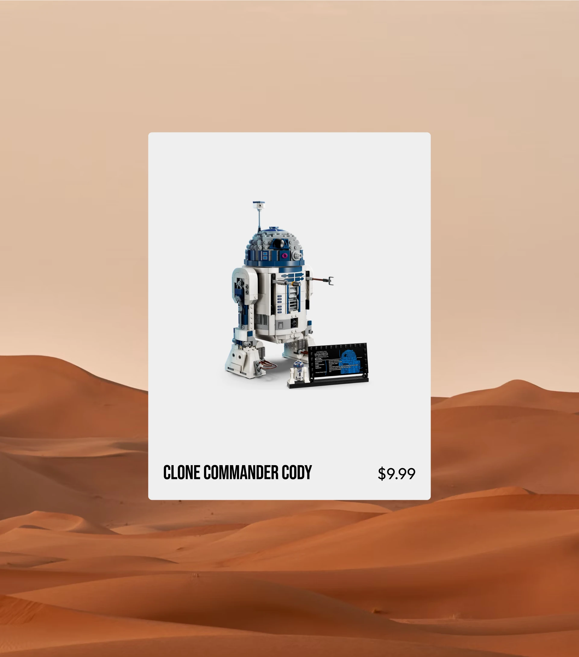
The interesting constraint is that almost none of the visual variety can live in the interface. Product photography already brings colour, texture and chaos, so the frame around it has to give way. Everything is built from a small set of blocks that repeat: a collection header, a product card, a detail panel, a promotional tile.
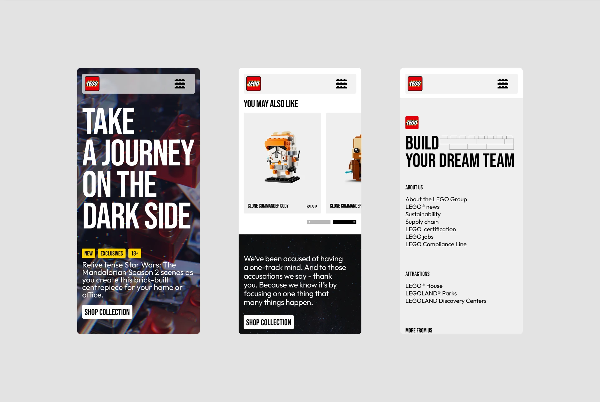
The product page
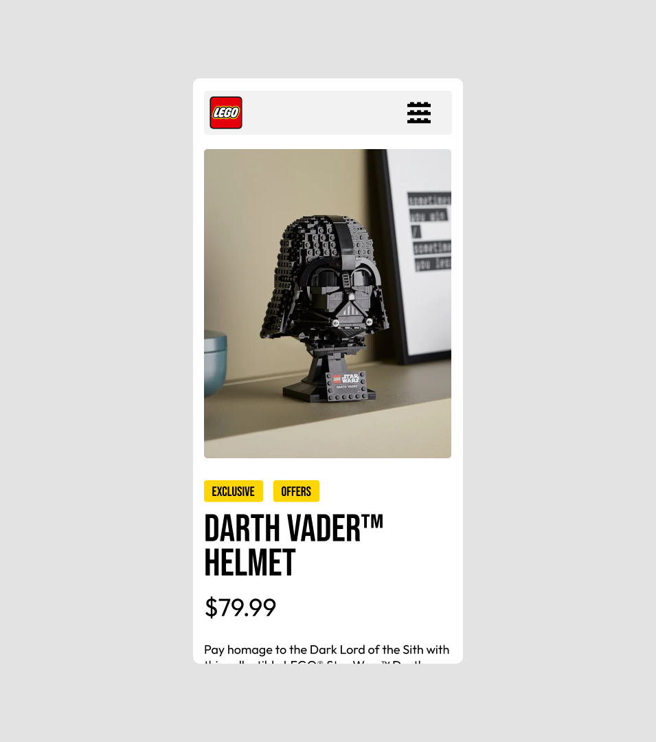
Motion is the brand voice here
The renders and animation are mine as well, built in Blender and After Effects. They exist to answer a specific question: whether the brand's physicality — the weight and click of the bricks — can be carried by the page rather than by the product photography alone.
Motion also does quiet work at the smallest scale. The menu is not a hamburger icon with a LEGO skin on it — it is a brick, and it behaves like one.

The full visual presentation is on Behance.