Mobupps·Head of Design·2026·12 min
Paggy: a rough draft in, a brand-perfect deck out
An internal service that reads a manager's own PowerPoint draft and rebuilds every slide on the company design system — in about two minutes, where a designer used to spend three to six hours. I designed and shipped it end to end: research, product strategy, the design system, the interface, the pipeline rules, the admin tooling and the telemetry.
- The problem
- Every client deck started as a rough .pptx a manager typed in an hour, and ended as something a designer rebuilt by hand over three to six hours. The design system lived in Figma, where only a designer could reach it — so brand quality was not a rule inside the product, it was a person.
- What I did
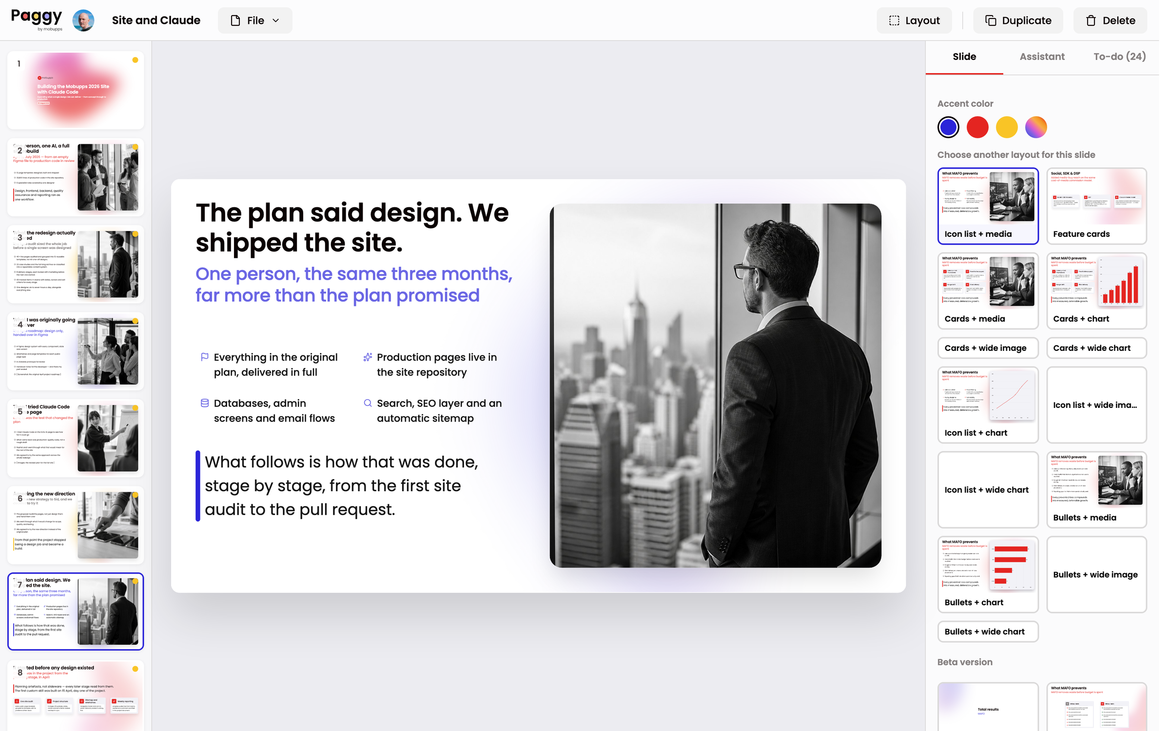
- A service that reads the manager's own draft and rebuilds each slide against a library of 73 layouts. Deterministic first: scripts read the drawn structure of the draft and score it, and a language model is consulted only on the slides the rules genuinely cannot resolve — and even then it may only relocate the manager's own words, never write new ones.
- What came of it
- Live and used across the company since August 2026. 95.4% of 53,304 logged layout decisions were taken by rules alone, at zero token cost; a full week of company-wide use costs under four dollars in model spend.
The problem was structural, not a discipline problem
Every client deck at Mobupps started the same way: a manager typed a rough .pptx in about an hour. Then it went to design, where someone rebuilt it by hand — three to six hours per deck.
With one designer and dozens of decks a month, that queue became the bottleneck on everything the company sent out. And every deck that skipped the queue reached a client off-brand.
The interesting part is why. The design system lived in Figma, where only a designer can reach it. Brand quality was not a rule inside the product. It was a person.
I sat with the people who actually send decks — marketing and sales managers — and watched them build one. The pattern was identical every time: the content was already finished, and everything after that was fighting the slide.
When I later built the parser, the evidence showed up in the files themselves. I had to teach it to read structure managers had drawn rather than marked up: stat boxes that were really key figures, panels made of rectangles, tables built from aligned text boxes, headings distinguished only by being bold and slightly larger, bullet markers typed as emoji.
They were not being careless. They were expressing real structure with the only tools they had, and no downstream system could read it. Telling people to use the template harder would not have fixed that. Reading their intent would.
What it does
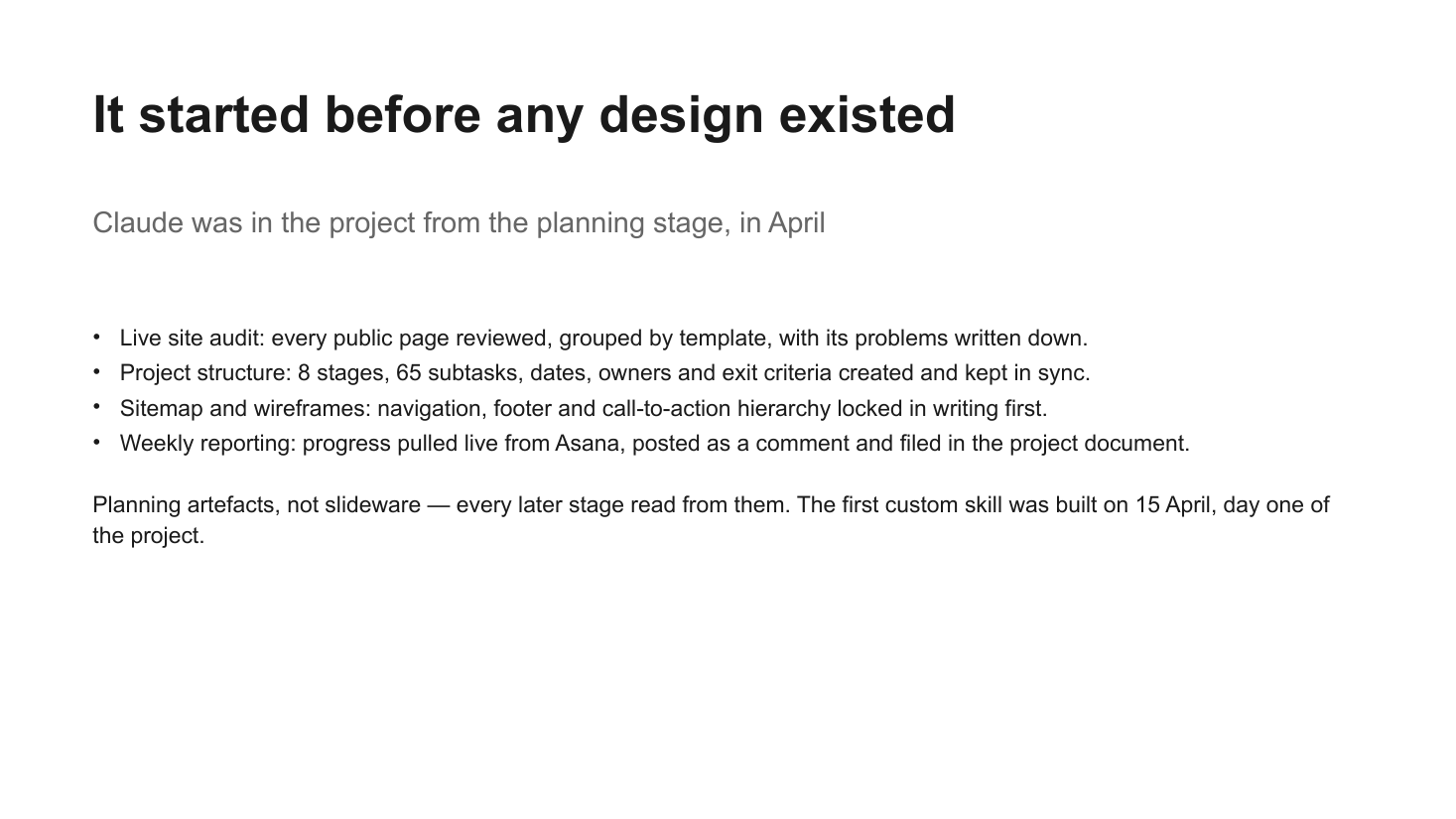
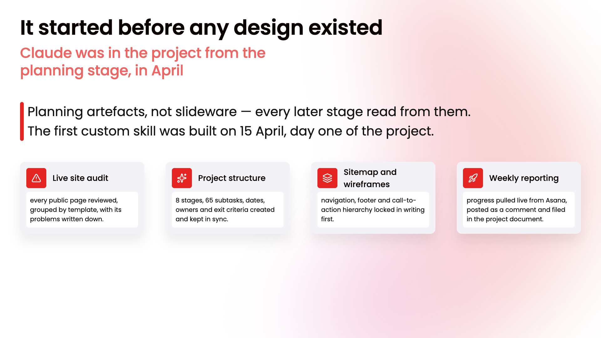
The same slide, straight from a manager's draft and after the rebuild. Nothing was rewritten: the four bullets became four titled cards, the trailing paragraph was recognised as a summary and promoted into the insight block, and the subtitle took the accent colour.
Decision 1 — the design system is the output contract
The options. Clean up the manager's own slide, preserving their formatting where possible. Or throw the formatting away, keep only the content and its structure, and rebuild the slide from scratch on a fixed layout.
The trade-off. Rebuilding is strictly harder, and it takes something away from the manager: their arrangement does not survive. In exchange, every slide that comes out is on-system by construction. There is no "mostly consistent" state left to police.
Why I chose it. Preserving formatting means inheriting every inconsistency the tool was built to remove. It also makes the output unpredictable, which makes it untestable. Rebuilding means the pipeline is a function: given this content, this layout, deterministically. That is what made everything downstream possible — including being able to write a regression suite at all.
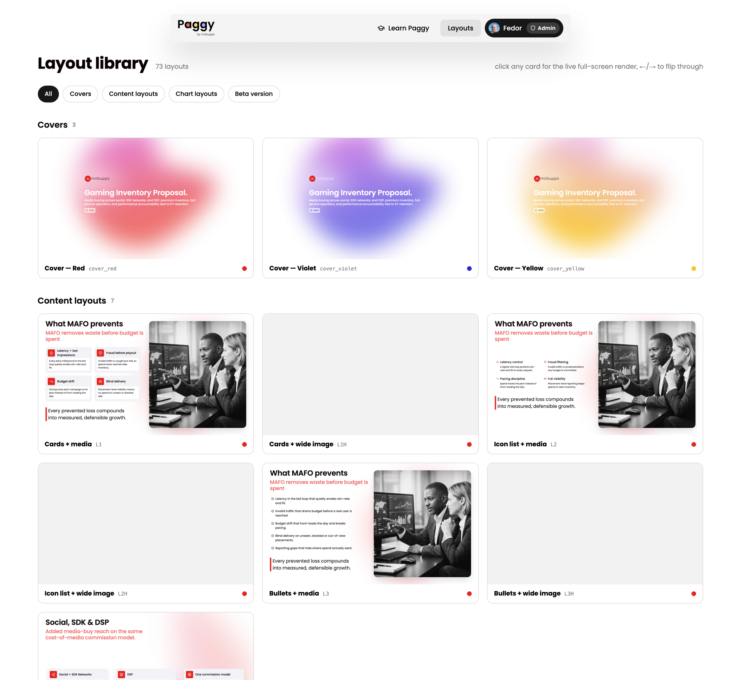
The cost is real and I paid it in code. Because content must survive a rebuild, there is a fixed ladder of fallback strategies for anything that does not fit the chosen layout, and a last-resort visible panel showing the manager exactly what could not be placed. Content is never silently dropped, and that rule is enforced in the pipeline rather than in documentation.
Decision 2 — three architectures, and why the boring one won
This is the decision the whole product rests on. I built the first version, killed it, and wrote down why.
Direction 1 — built, then killed
An AI skill that draws into Figma. My actual first attempt, April 2026: connect the model to the Figma file and have it assemble slides from the real components.
Killed because a designer still had to export by hand, the PDFs were enormous, and there was no way for a manager to touch it. It automated the fun part and left the bottleneck intact.
Direction 2 — rejected on paper
Prompt-to-deck. One model call per slide writes the copy, picks the layout and fills it.
Rejected because it is non-deterministic — the same draft gives a different deck twice — it invents content in client-facing material, and cost scales with every slide the company will ever make.
Direction 3 — shipped
A deterministic pipeline with AI as a narrow fallback. Scripts read the draft's drawn structure and score it against the layout library. The model is consulted only on genuinely ambiguous slides, and even then it may only relocate the manager's existing text.
Chosen because it is repeatable, auditable, effectively free — and every failure becomes a rule I can write down and test.
I treated the AI budget as a design constraint rather than an optimisation. Anything the rules can decide, the rules must decide. The model is a fallback for ambiguity, not an engine.
Eight weeks of production data says the constraint held: 95.4% of 53,304 layout decisions were taken with no model at all, and a full week of company-wide use costs under four dollars.
Three guards make the AI path safe to ship:
- The grounding gate. The model may relocate the manager's text between slots. Any string it did not find in the draft is dropped before it can render. Brand voice cannot drift, and nobody has to proofread the machine.
- The acceptance gauntlet. Model output passes shape validation, cover-family checks and group-integrity checks — a heading is never separated from its own children. A rejected mapping falls back silently to the rules.
- The copy box. The sanctioned last resort. Text with nowhere to go lands in a per-slide to-do box with a copy button — never a squeezed strip, never a deletion.
The editor — fixing the last 10%
The build is never the whole job. The editor exists so a manager can finish a deck without a designer, and every capability is reachable both by hand and by asking the assistant, because they emit the same operations.
It is selected — drag it, pull a handle, swap the icon, let Paggy pick one, or turn the shadow on.
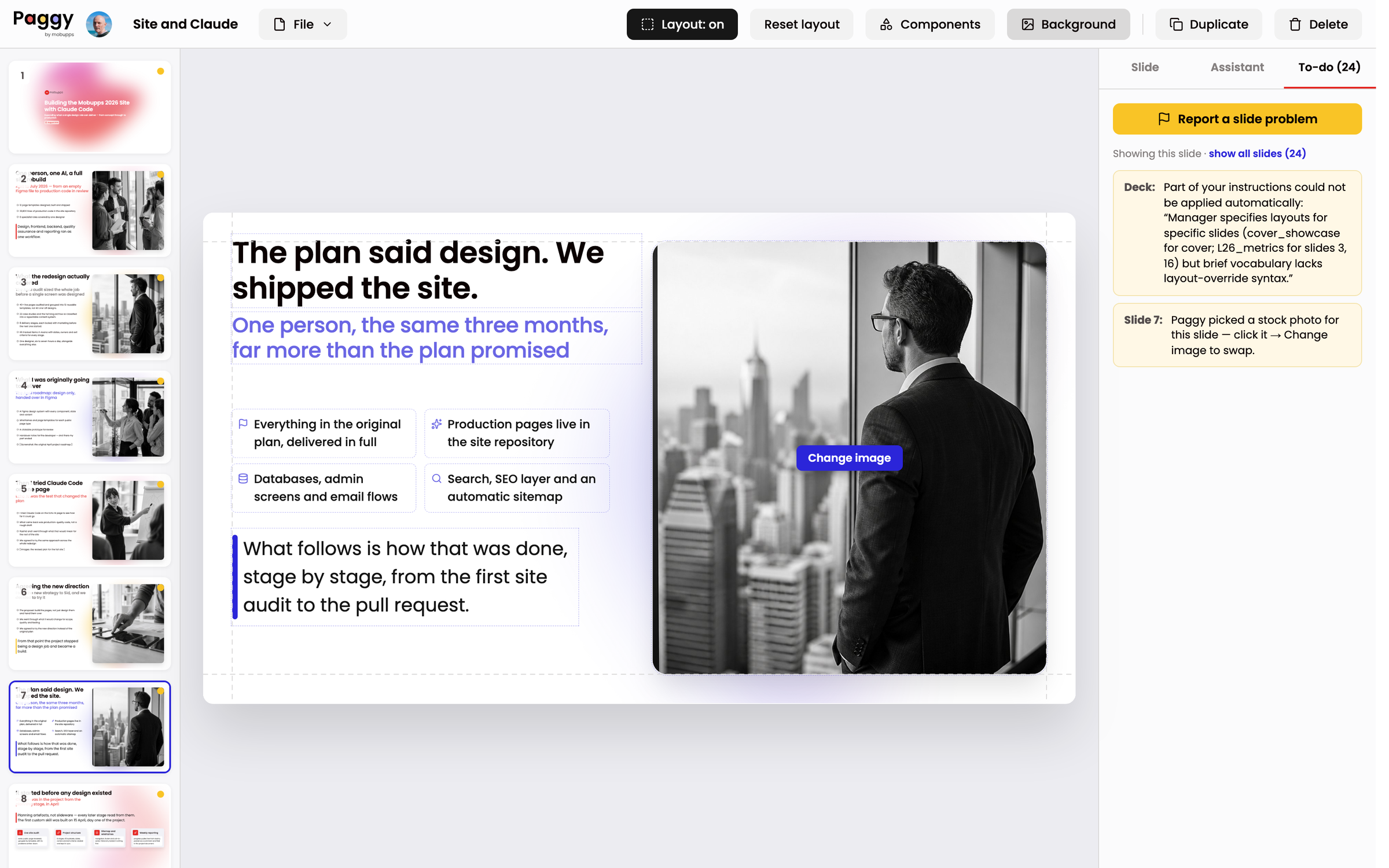
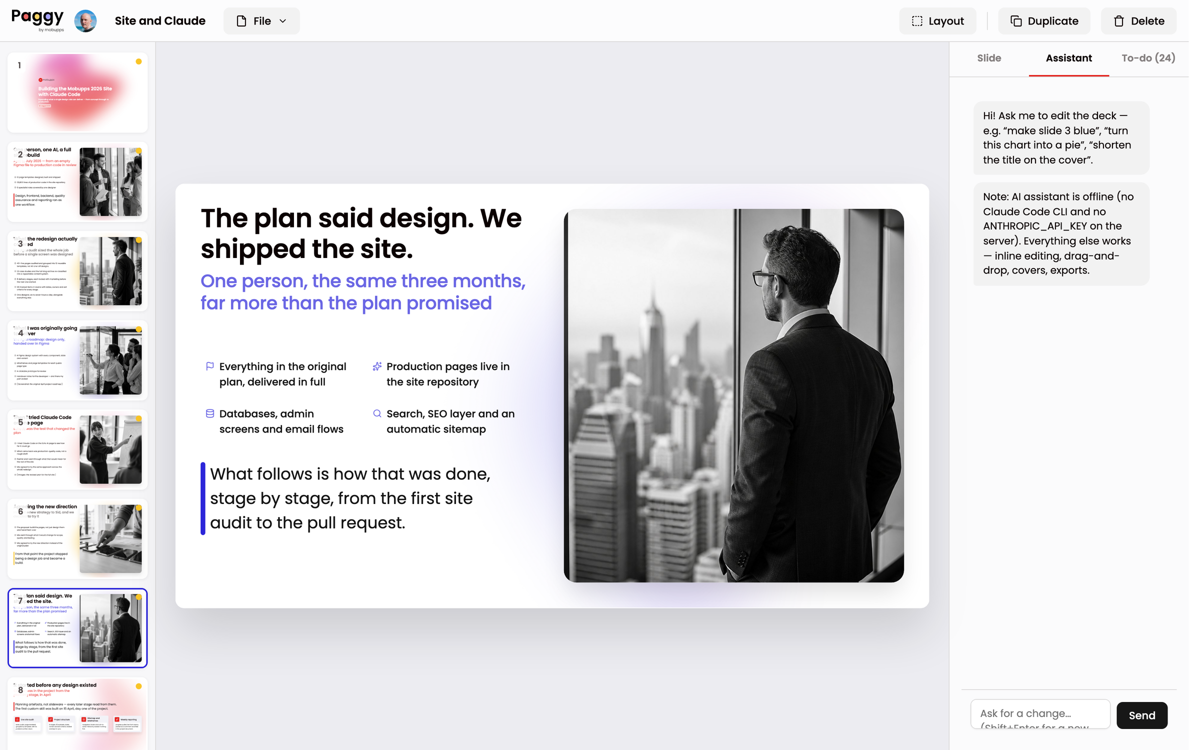
Layout switching is lossless: content never duplicates, overflow clones are re-absorbed on roomier layouts, and crops and shadows carry across.
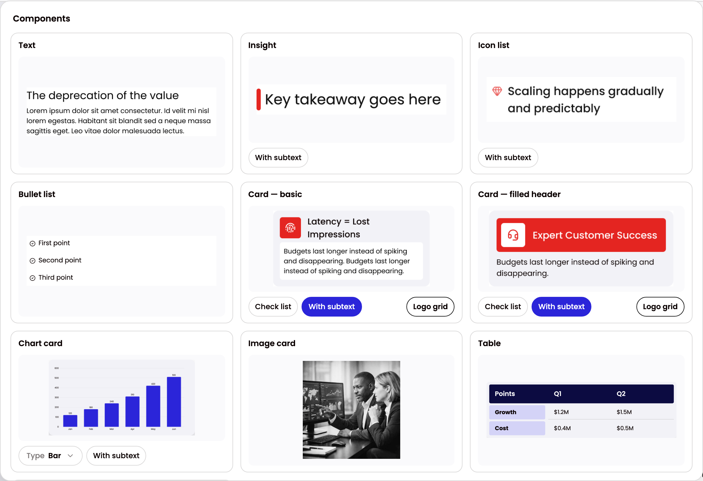
Three more of those ten are below, running the same way the card above does.
Click a cell, Shift-click another for a range — then merge, split, align, or add and remove rows and columns.
Press the black grid button to pick logos, or step the gap. The wall re-wraps as it grows.
Toggle the caption or the shadow, and resize the card — the chart re-renders to fit.
The part I am most proud of — one correction becomes a permanent rule
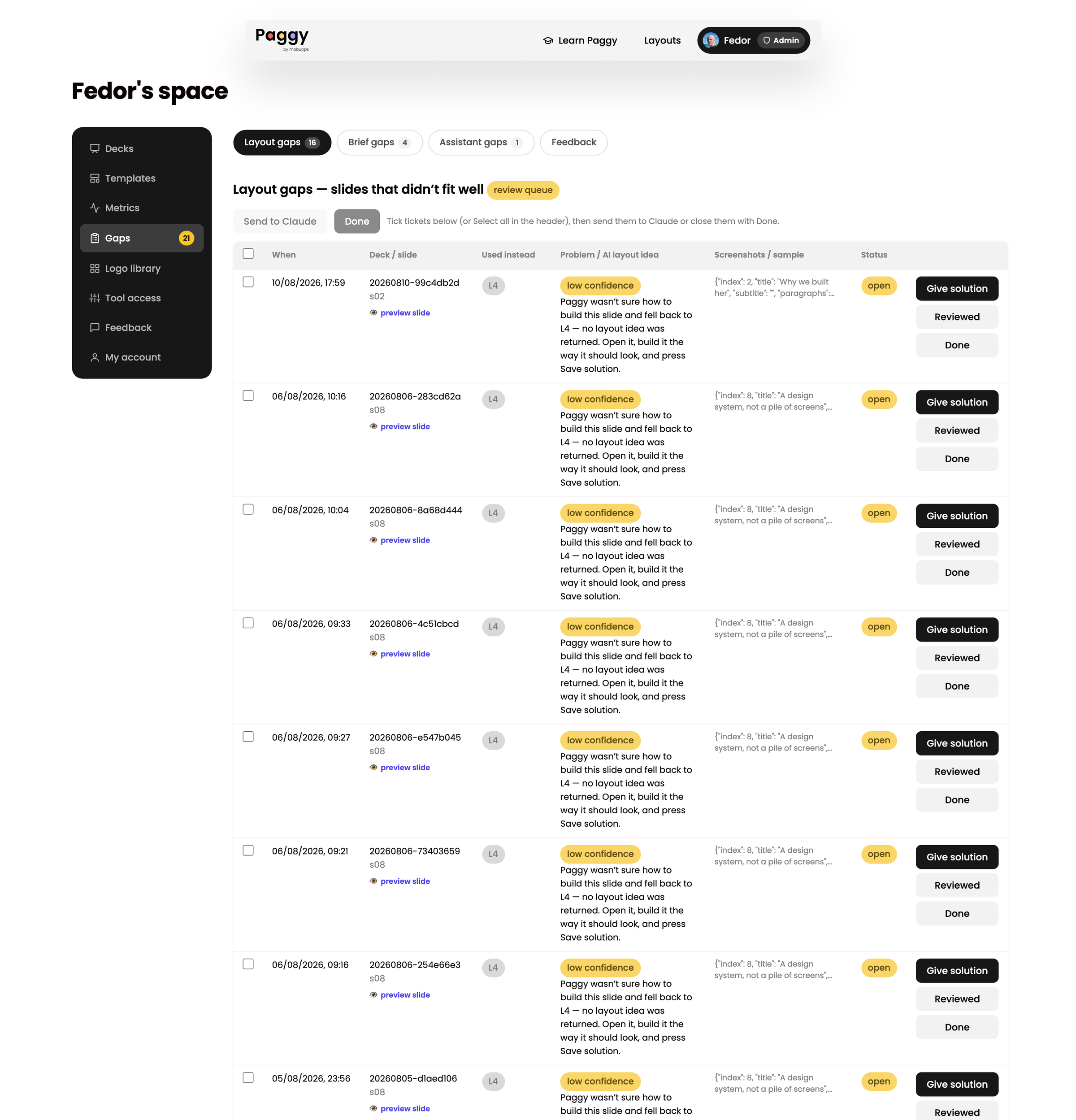
A manager reporting "this slide looks wrong" is worth very little. A manager reporting it, the system freezing the exact slide, a designer rebuilding it by hand, and that rebuild becoming a test that can never go red — that is worth everything.
The loop runs: report → freeze → queue → solve → replay → generalise → lock.
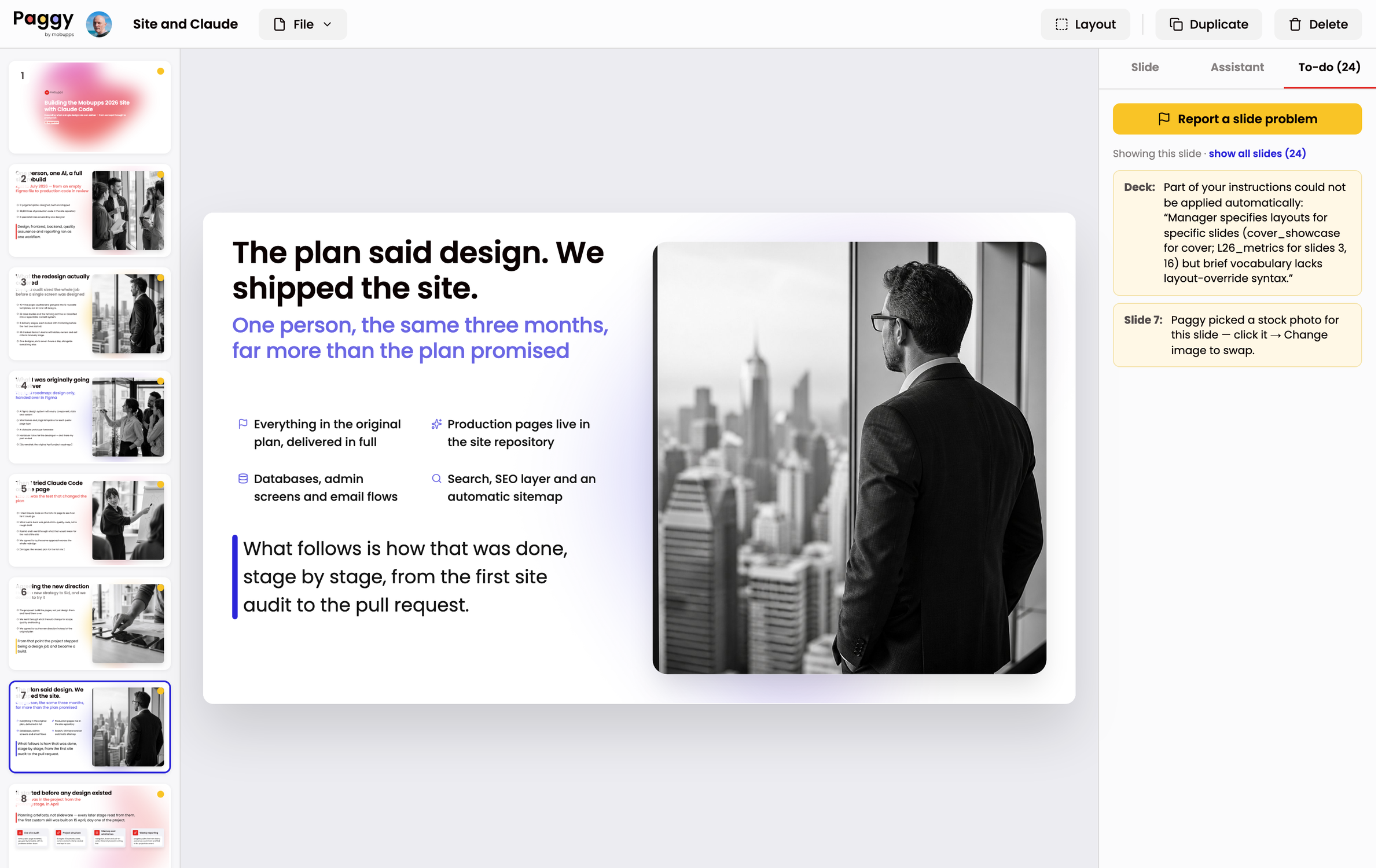
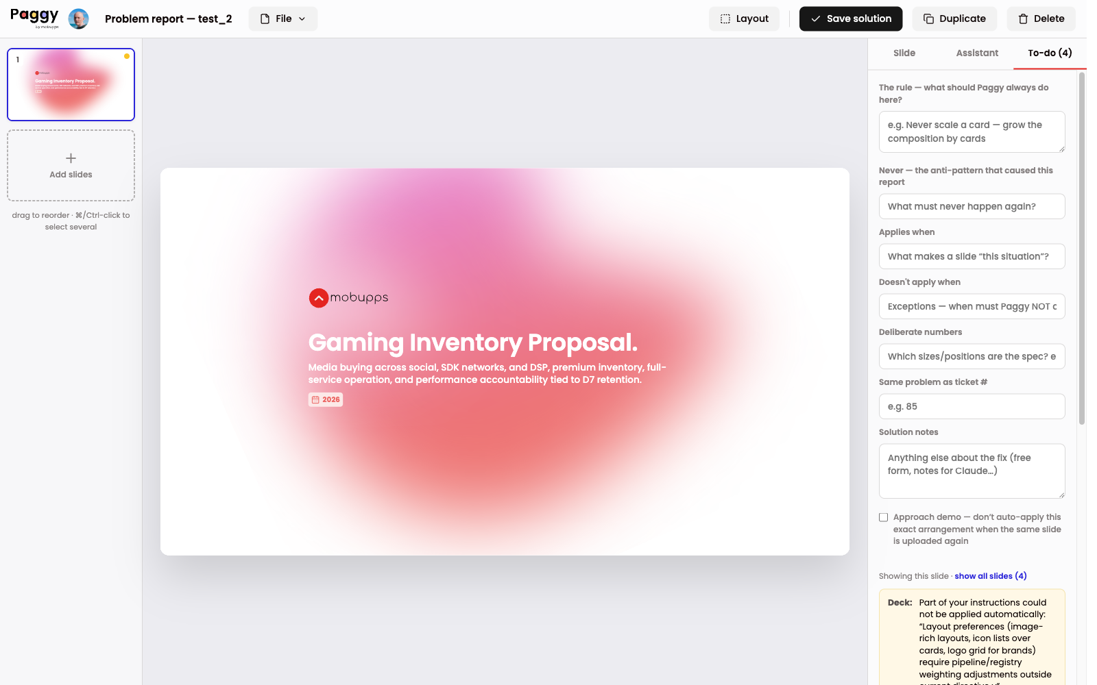
A rebuilt slide shows what the answer is, but not why. Whoever implements the general rule then has to infer intent from geometry — and infers wrong. So the solution screen asks five questions instead: what should the product always do here; the anti-pattern that caused the report; what makes a slide this situation; the exceptions; and which numbers are the spec rather than incidental.
The rule I locked, in my own words: a hand-built solution is the specification. When it contradicts existing build logic, the logic changes — never the solution.
One real example. The fitter used to stretch a lone card across a slide to fill space. My hand-built solution kept every card at its design width and turned the homeless paragraph into more cards. That single correction became a general rule — never scale a card, grow the composition instead — plus a new automated check kind that enforces it on every future build.
Two guards I would not ship without:
- Exact match only. A saved solution replays only when the re-uploaded slide is byte-for-byte the same content. Fuzzy matching would be silent learning — the product quietly behaving differently for reasons nobody can audit. It is banned in writing.
- Replay is never a substitute for the rule. The regression gate builds every ticket with replay switched off, so a stored answer can never mask a broken general rule.
The bug that taught me to test both paths
A ticket was solved, the gate was green, and the same slide still shipped broken.
The gate built every draft with AI switched off, because that is the deterministic path and determinism is what I was trying to guarantee. But in production the scorer handed that slide to the model, which replaced my solved mapping with a flat seven-row bullet list.
The mistake was a category error about what I was testing. I had been testing my half of the pipeline, then shipping a product that runs both halves. A test that never exercises the path production takes is not a safety net — it is a comfort object, and it is worse than no test, because it buys false confidence.
Every ticket is now built twice: once with rules only, and once replaying the model's real recorded answer, frozen as a fixture so the replay costs nothing. A ticket that cannot be asserted on the AI path prints "det ONLY" in the report, because silent partial coverage is how the first bug survived.
Analytics that refuse to lie at twelve users
I built the measurement system before launch on purpose, and the hardest decisions in it were about what not to build. The rule I wrote down first was the size of the audience: dozens of people, not thousands.
Instrument only what is irreversible. A crashed build, a failed export, a deleted deck, a dropped batch of edits — those vanish forever if nothing records them at the moment they happen. Everything else is already on disk, or answerable by walking to someone's desk.
At small N, a percentage is a lie with a decimal point. Users are reported as names, not rates. The funnel is a clickable list of decks, not five bars. Every percentage prints its raw fraction beside it. Percentiles and medians are banned outright — the 95th percentile of twenty values is the second-largest value.
I wrote down what I refused, and why, so it cannot be re-proposed without new evidence: cohort grids, per-feature sparklines, cost histograms, a satisfaction survey (worse than walking to a desk at this size), and any general client-side analytics library. The only client-side telemetry that exists is error-shaped.
Every metric card also states in advance what would be done if the number moves. A reading must produce exactly one of three things: a code change landing with its regression gate, a conversation with a named person, or a line in the backlog — including an explicit rejection. A card that produces none of those for a quarter gets deleted.
What testing and live use actually taught me
- Managers read a stretched card as a broken card. The fitter filled empty space by scaling one card wide. Every single person who saw it reported it as a bug. No exceptions.
- Decoration was outranking content. An automatic stock photo held its column while the manager's own paragraph had nowhere to go and fell into the copy box.
- People rewrote text more than they moved things. The rework buckets pointed at the parser, not the layout engine — the opposite of where I expected to spend the sprint.
- A thumbs-down with zero notices is the worst signal there is. It means the to-do panel is blind to an entire defect class: the deck looked confident and was wrong.
- Nobody noticed the feedback ask in the corner. The post-export verdict strip sat bottom-right, where it merged visually with the side panel. Moved to top-centre over the canvas, it started getting answers.
Result
A live internal service, and a design system that now exists in two synchronised forms — a Figma library for designers, and a machine-readable rule set the product enforces on every slide.
Some of the rules the system enforces rather than suggests:
- Chart text never drops below 15px and always sits in ink. A chart that cannot be read at the back of a room is a failed chart.
- When all values sit in a narrow high band — 99.92% to 99.99% uptime — the axis floor lifts so the variation is visible.
- Chips are pills, actions are square. Journey chips read green for done, grey for not yet, red for failed. Yellow is the attention accent and is banned as a journey state.
- No ALL CAPS anywhere. A draft title typed in capslock is re-cased to sentence case at parse time, with acronyms and brand names protected.
What I would do differently
I was designing rules, not screens. The screens took weeks. The rules took the whole summer. What a card may never do, what the model is allowed to touch, what happens to a sentence that does not fit — those are the product, and they are design decisions even though none of them are visible in a mockup.
I built the correction loop before the measurement system, and I would reverse that order. For the first stretch, the only signal telling me what to fix was my own judgement about which slides looked wrong — so I fixed the problems visible to me rather than the ones frequent for other people. The queues that count how often an instruction goes unhandled arrived later, and the first thing they showed me was that frequency, not severity, is the argument for building something.
One module grew to just under 8,000 lines because it was where the pipeline lived and every new rule had a natural home there. It is well documented and under test — which is what you say about a module you should have split three rules ago.
Scope, honestly
Paggy is an internal product for one company, and it is still growing: layout coverage has gaps the queue is working through, the brief vocabulary is deliberately small, and the population is too small for statistically strong claims. Percentages here are reported exactly as the panel reports them, with their raw fractions.
The measure I actually trust is the one that stayed true across 53,304 logged decisions: the rules, not the model, are doing the work.
The code is mine; a developer on the engineering team reviews it and promotes it to production. That is the whole division of labour.
What it does demonstrate is end-to-end product ownership — research, strategy, a design system in two synchronised forms, the interface, the pipeline rules, the admin tooling, the telemetry programme, and the maintenance loop that keeps all of it true.
Results
3–6h → 2min
To a client-ready deck
With the designer out of the critical path entirely.
95.4%
Decisions taken with zero AI tokens
Across 53,304 logged layout decisions over eight weeks of real use.
$3.73
Model spend, one full week
Notional API cost for company-wide use. The budget was a design constraint, not an optimisation.
67
Layouts in the library
Each rebuilt 1:1 from the Figma UI kit and given a machine-readable descriptor.
13
Hand-built fixes locked as tests
Every solved ticket became a permanent acceptance test asserted on both build paths.
5
Gates every change must pass
Rules, full regression, match regression, visual regression, ticket regression.