Product design · UX research·2026·10 min
Predictive banking for freelancers with variable income
A banking interface built around the one question a freelancer actually has: how much of this balance is really mine to spend? It turns a reactive balance display into a predictive decision-support system — researched, prototyped and usability-tested end to end.
- The problem
- Freelancers with variable income use banking interfaces that show a total balance but hide what is already committed — taxes, recurring costs, buffer. The result is a decision gap between what someone sees and what they actually have.
- What I did
- A Safe-to-Spend layer that separates liquidity from usable funds, and pulls future obligations into the moments where money is actually spent. Two personas, a competitive audit of four European banks, eight concepts, and two rounds of usability testing.
- What came of it
- A tested concept, not a shipped product. In the five-participant study, 4 of 5 reviewed the cash projection before confirming a transfer and 3 of 5 changed the transaction after seeing a projected dip near their tax deadline.
The problem is structural, not behavioural
Freelancers with variable income rely on banking interfaces that display a total account balance but do not reflect future obligations — taxes, recurring expenses, the buffer they are trying to protect.
Current banking systems visualise present money but hide future commitments. That creates a decision gap between what someone sees and what they actually have available.
It is tempting to read this as a discipline problem — people should just budget better. The research said otherwise. The disciplined freelancer I spoke to was already doing the work manually, in spreadsheets, and still did not trust the answer.
Who this is for
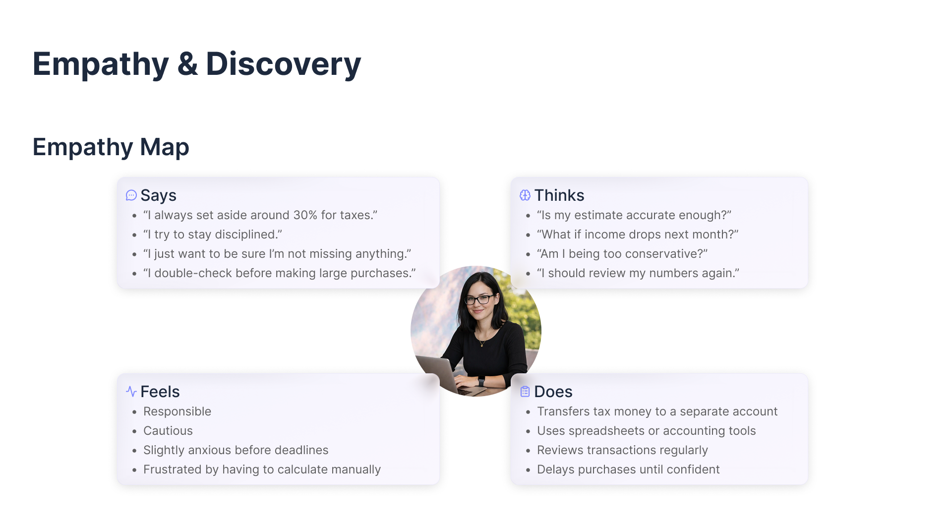
Two personas, built from the research, sitting at opposite ends of the same problem.
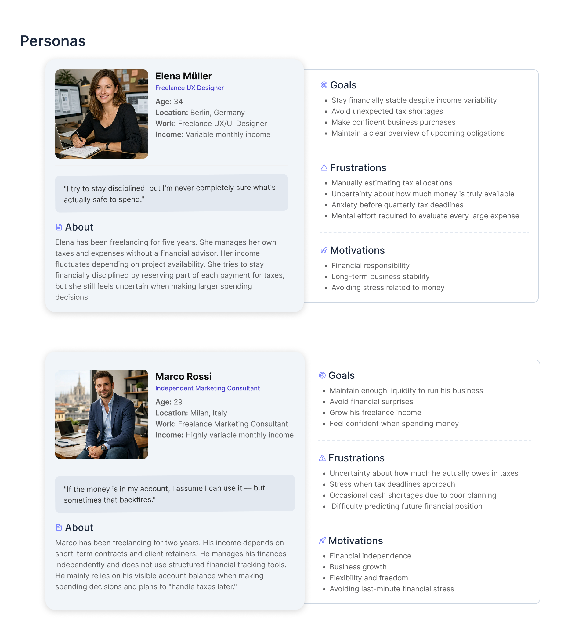
Elena Müller, 34, a freelance UX designer in Berlin, five years self-employed. She reserves part of every payment for tax and still hesitates before a large purchase:
I try to stay disciplined, but I'm never completely sure what's actually safe to spend.
Marco Rossi, 29, an independent marketing consultant in Milan, two years self-employed, no structured tracking at all:
If the money is in my account, I assume I can use it — but sometimes that backfires.
Elena's problem is cognitive load. Marco's is visibility. A design that solves only one of them fails the other.
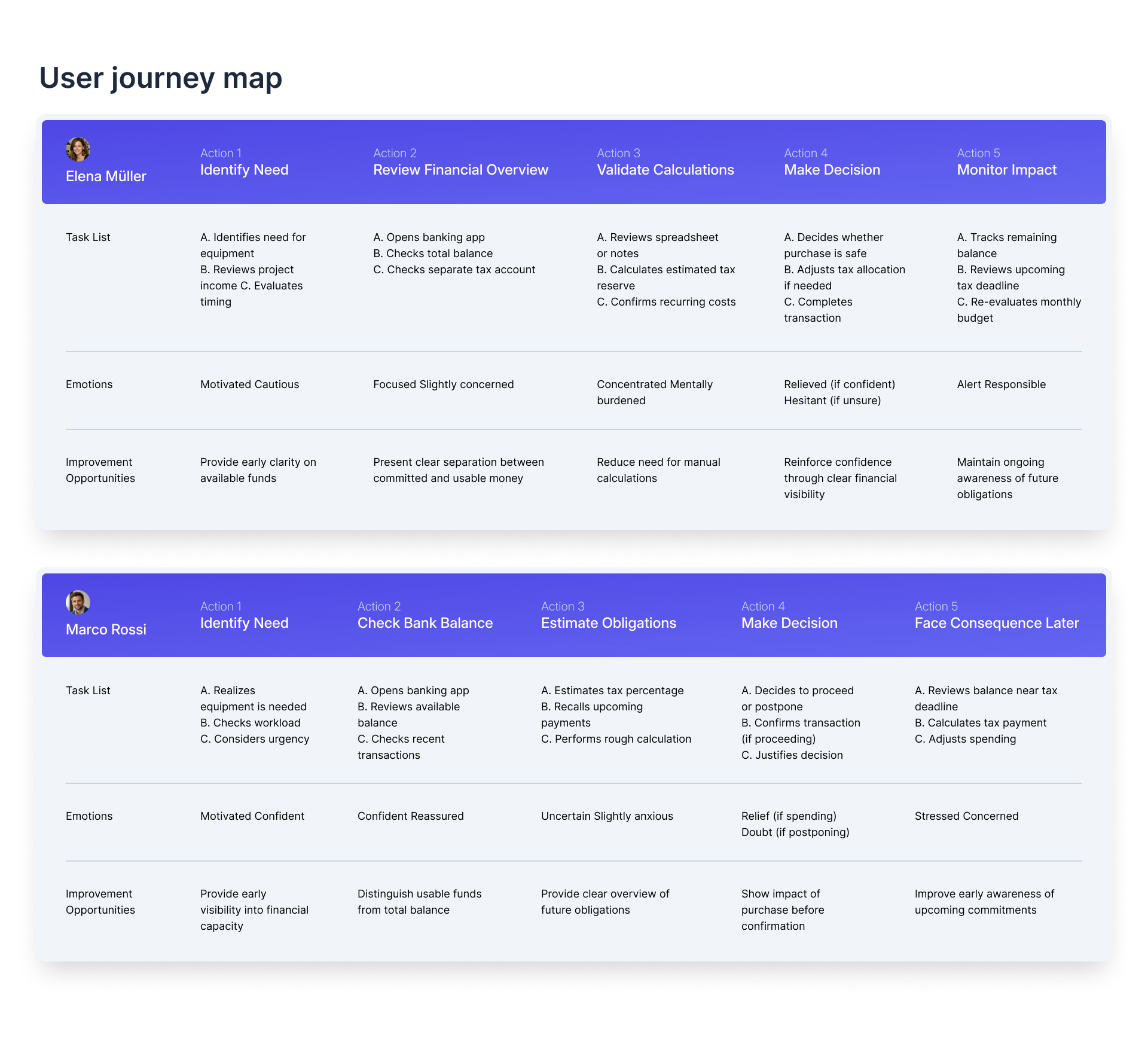
Define — the statements the design had to answer
Problem statement, Elena. A structured freelancer with variable income who actively manages her finances needs a clear way to confidently determine how much money is safe to spend, because she currently relies on manual calculations and separate tools which create mental effort and ongoing uncertainty about future tax obligations.
Problem statement, Marco. A reactive freelancer with irregular income who relies on his visible account balance needs a clear way to understand how much money is truly available, because his balance does not reflect upcoming tax and recurring obligations — which leads to uncertainty and financial risk.
The hypothesis. If a freelancer is shown clear visibility of committed funds and future obligations alongside the current balance, then they will make more informed spending decisions and reduce the likelihood of shortfalls.
The value proposition, deliberately written twice, because the same feature has to be sold to two different mindsets:
- For structured freelancers who track taxes manually — transparent visibility into committed funds and safe-to-spend amounts, reducing cognitive load and increasing confidence without removing control.
- For freelancers who rely on the visible balance — a clear line between total liquidity and committed obligations, preventing avoidable shortfalls.
Ideate — where the market actually leaves a gap
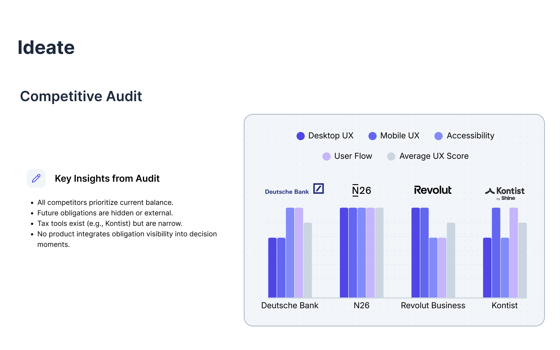
The audit's conclusion was narrow and useful:
- Every competitor prioritises current balance.
- Future obligations are either hidden or pushed into an external tool.
- Tax tools exist — Kontist, for instance — but they are narrow, and they sit beside the bank rather than inside the decision.
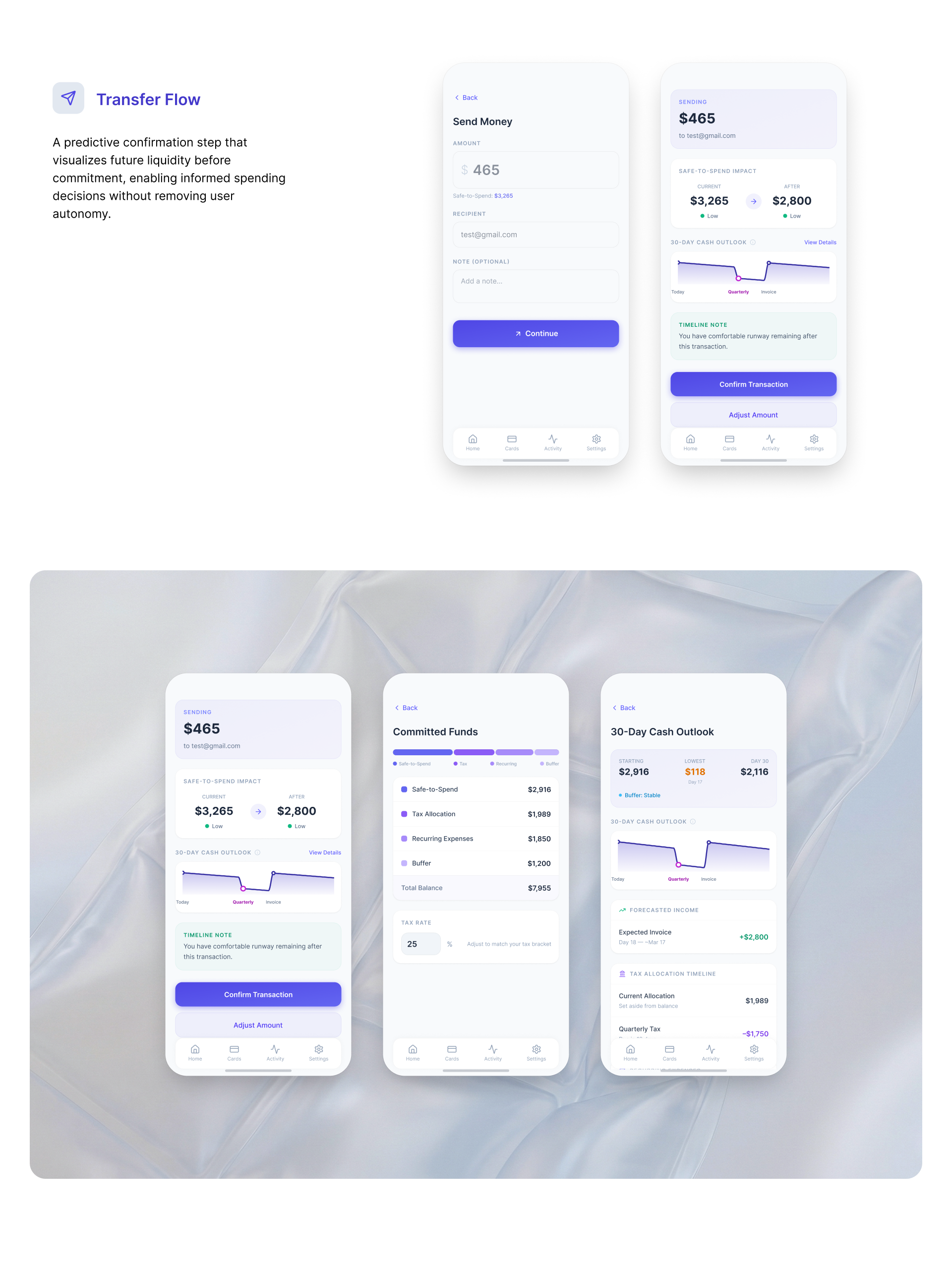
- No product integrates obligation visibility into the moment money is spent.
That last line is the whole opportunity, and it is why the design work concentrated on the transfer flow rather than the dashboard.
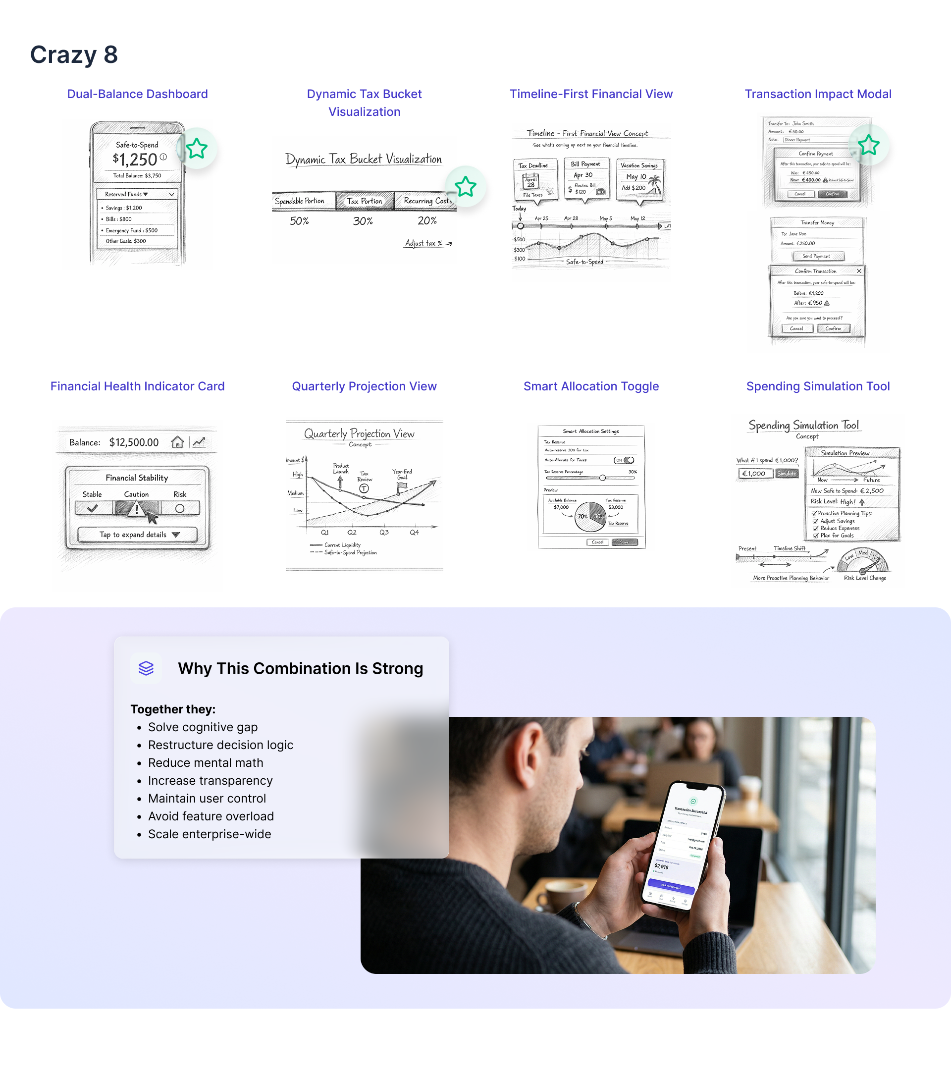
Four of the eight survived into the design, chosen because together they solve the cognitive gap, restructure the decision logic and increase transparency — while keeping the user in control and avoiding feature overload.
Design — architecture before screens
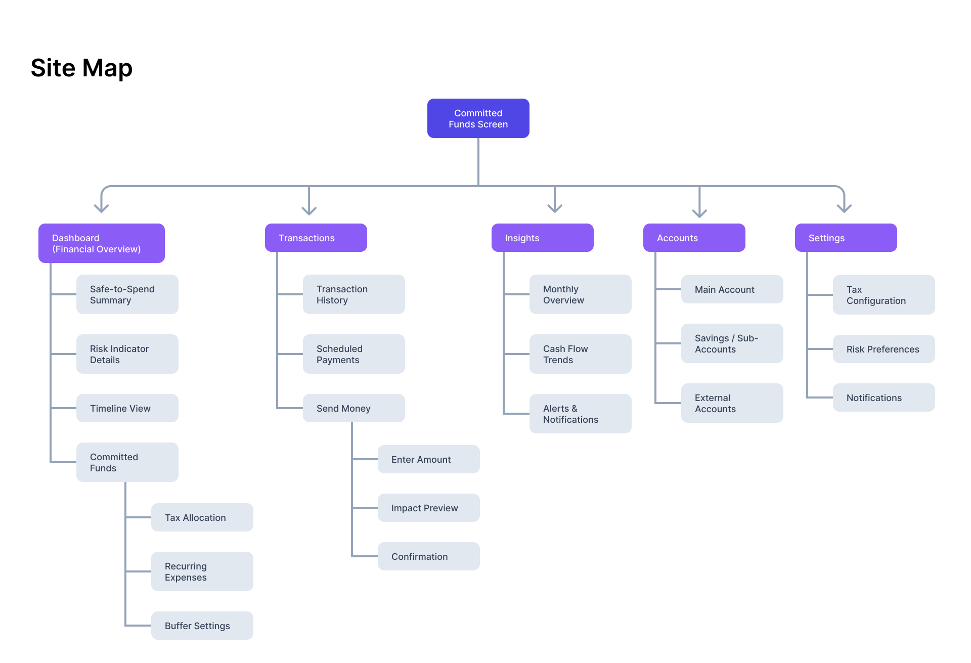
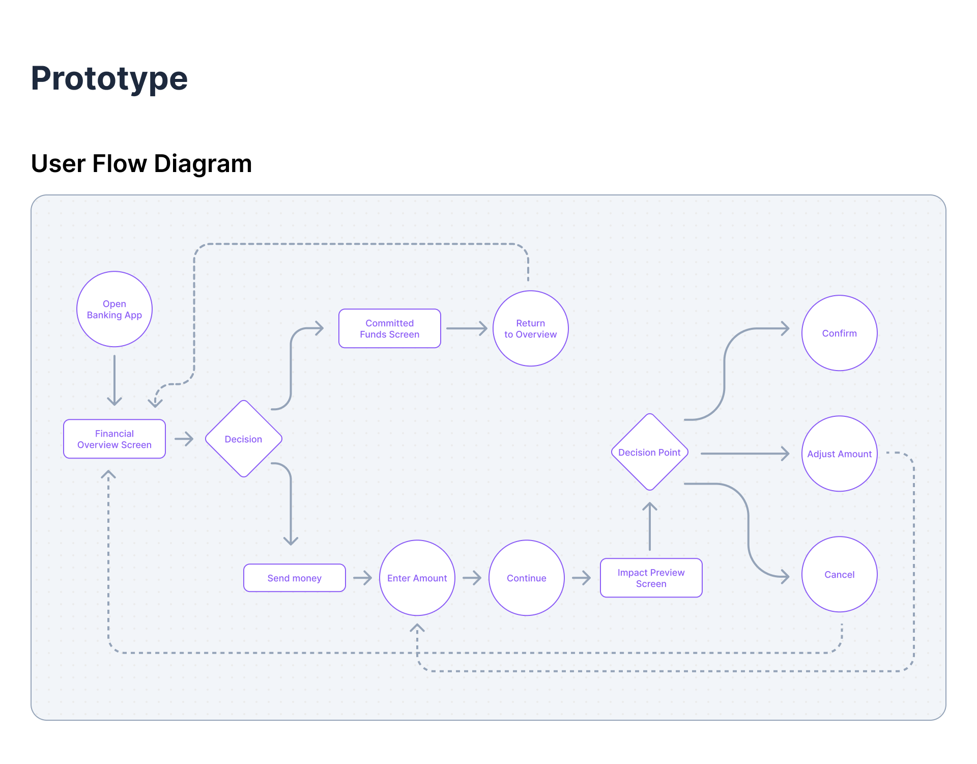
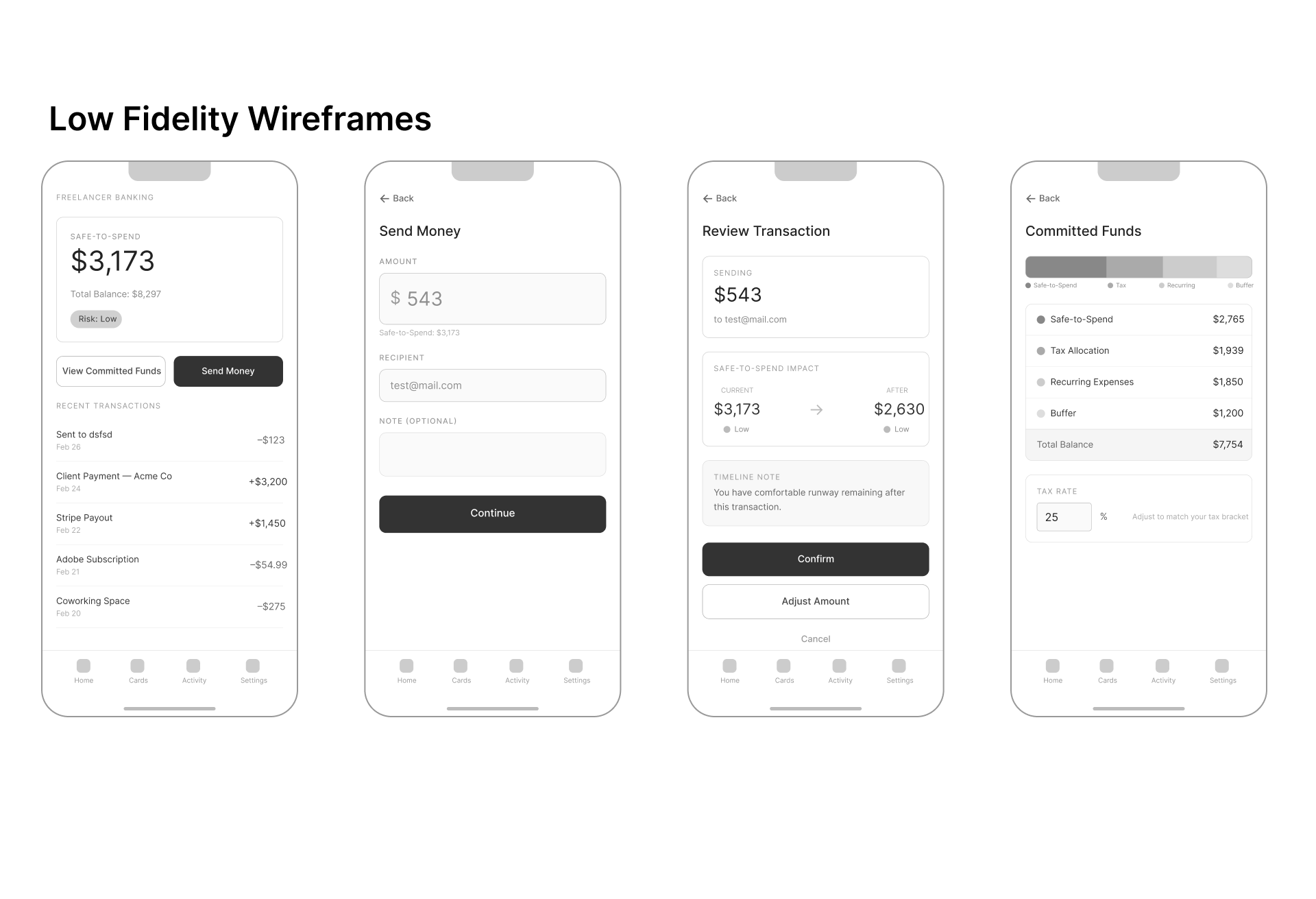
Testing changed the design twice
Five participants, tested on the low-fidelity prototype. Two changes came directly out of it, and both are visible as before-and-after below.
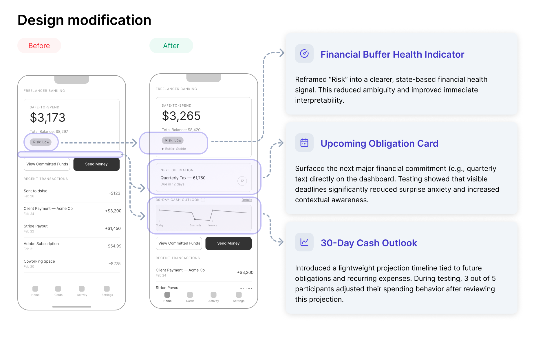
Reframing risk. The first version labelled the state "Risk: Low", which tested badly — participants could not tell whether that was a judgement about them or about the account. Restating it as a buffer health signal removed the ambiguity.
Surfacing the next obligation. Putting the upcoming tax deadline on the dashboard was the single change that most reduced surprise. Visible deadlines turned an abstract worry into a date.
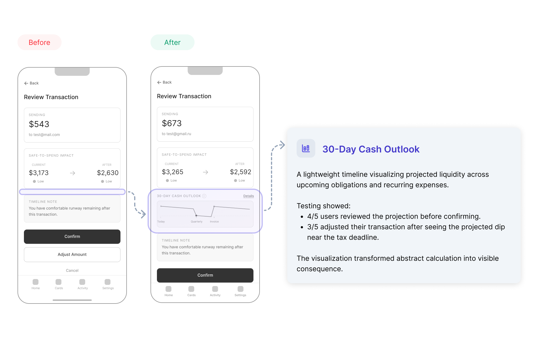
The 30-day cash outlook is the piece I would keep if I could keep only one. In testing, 4 of 5 participants reviewed the projection before confirming, and 3 of 5 changed their transaction after seeing the dip near the tax deadline.
The visualisation turned an abstract calculation into a visible consequence.
The solution
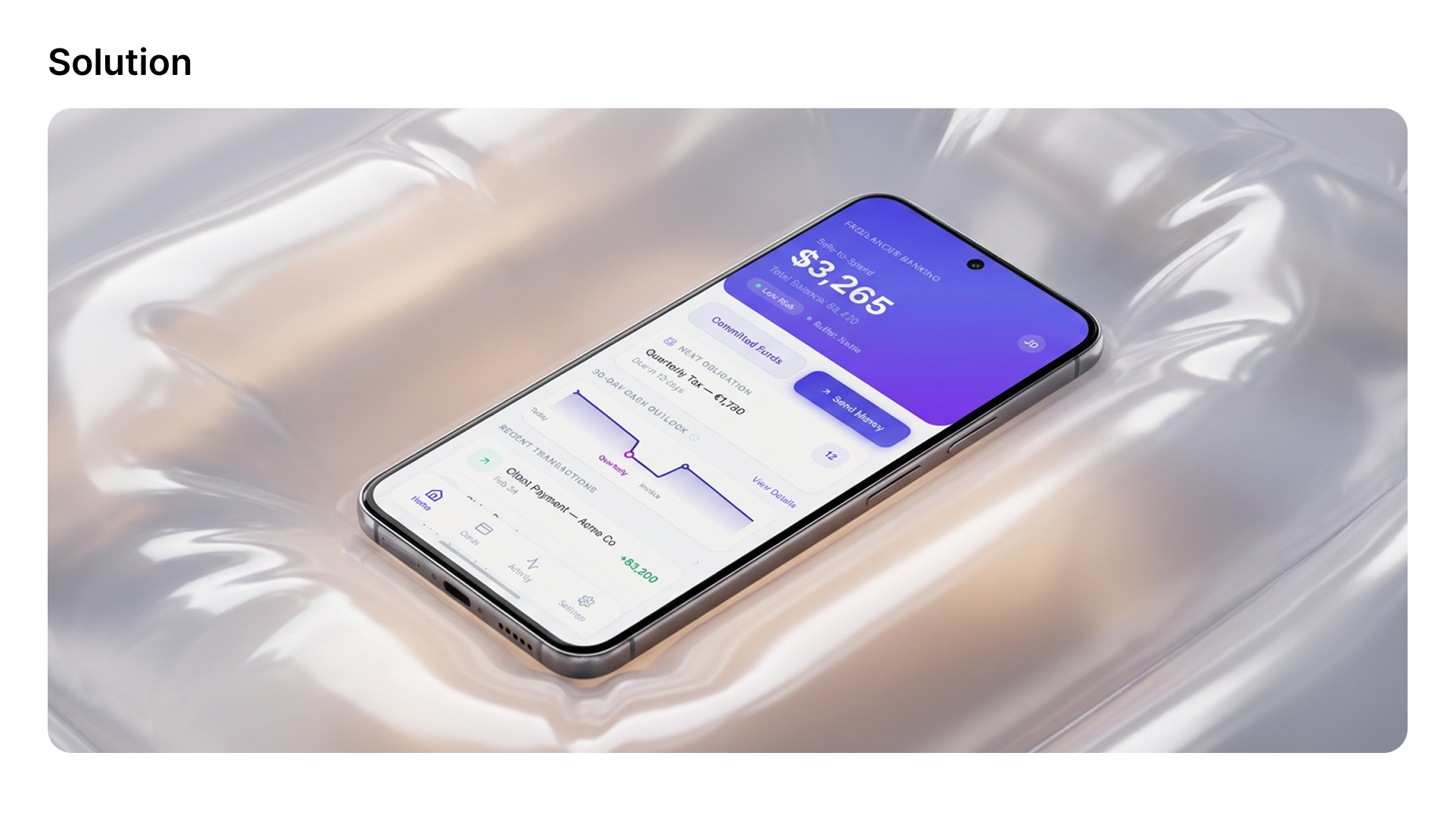
Safe-to-Spend as the primary metric. Instead of centring the account balance, the interface leads with what is genuinely available once tax, recurring costs and buffer are set aside. The total balance is still there — it is just no longer the number that makes the decision.
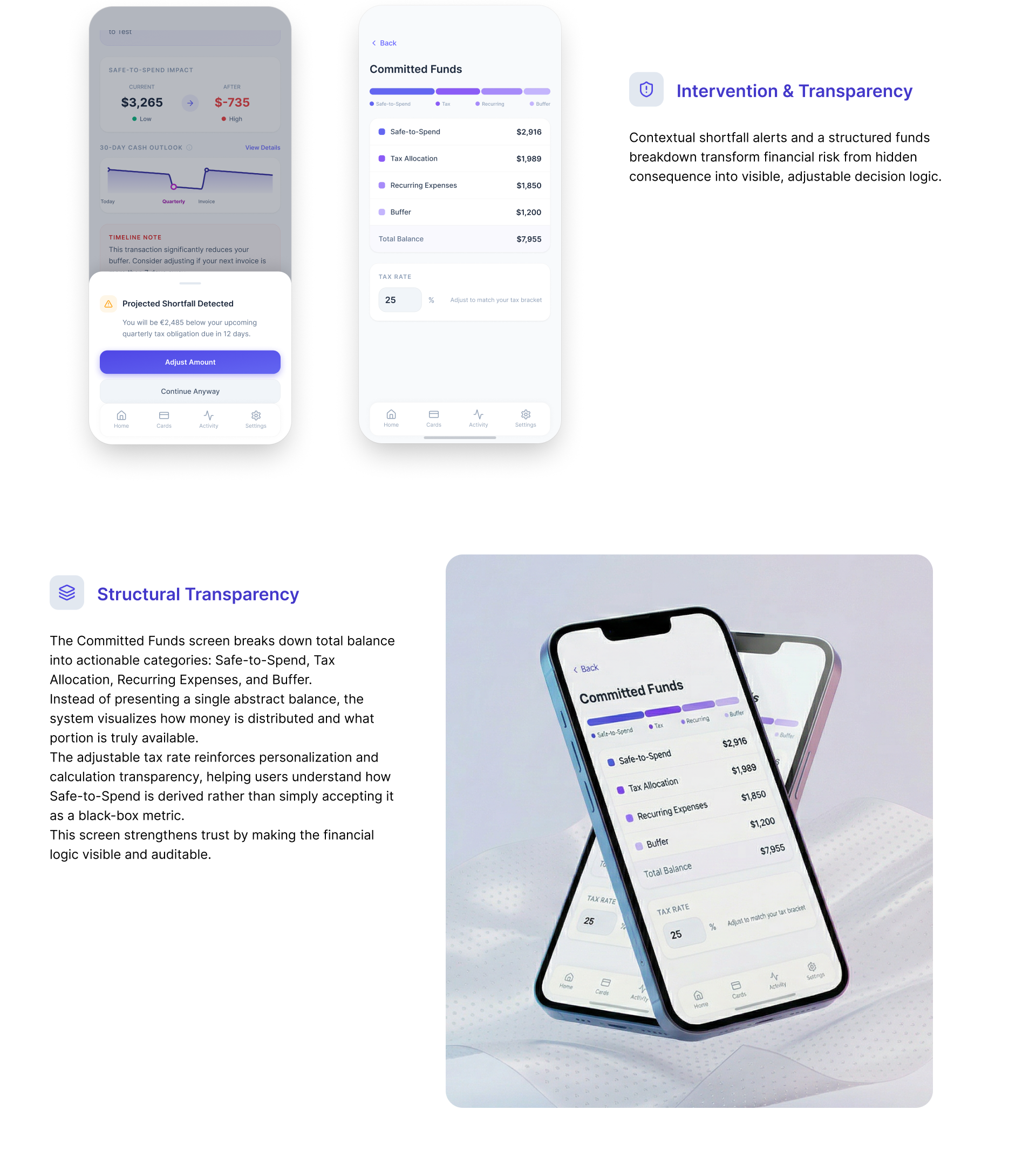
Intervention without restriction. When a transfer would push someone below an upcoming obligation, the system says so — with the number and the date — and then offers Adjust Amount or Continue Anyway. It never blocks the transaction. Autonomy was a constraint, not a nice-to-have: a banking app that refuses your own money is a banking app you stop trusting.
Structural transparency. The Committed Funds screen breaks the total into Safe-to-Spend, tax allocation, recurring expenses and buffer, with an adjustable tax rate. Users trusted the system more when they could see why a number changed.
The design system
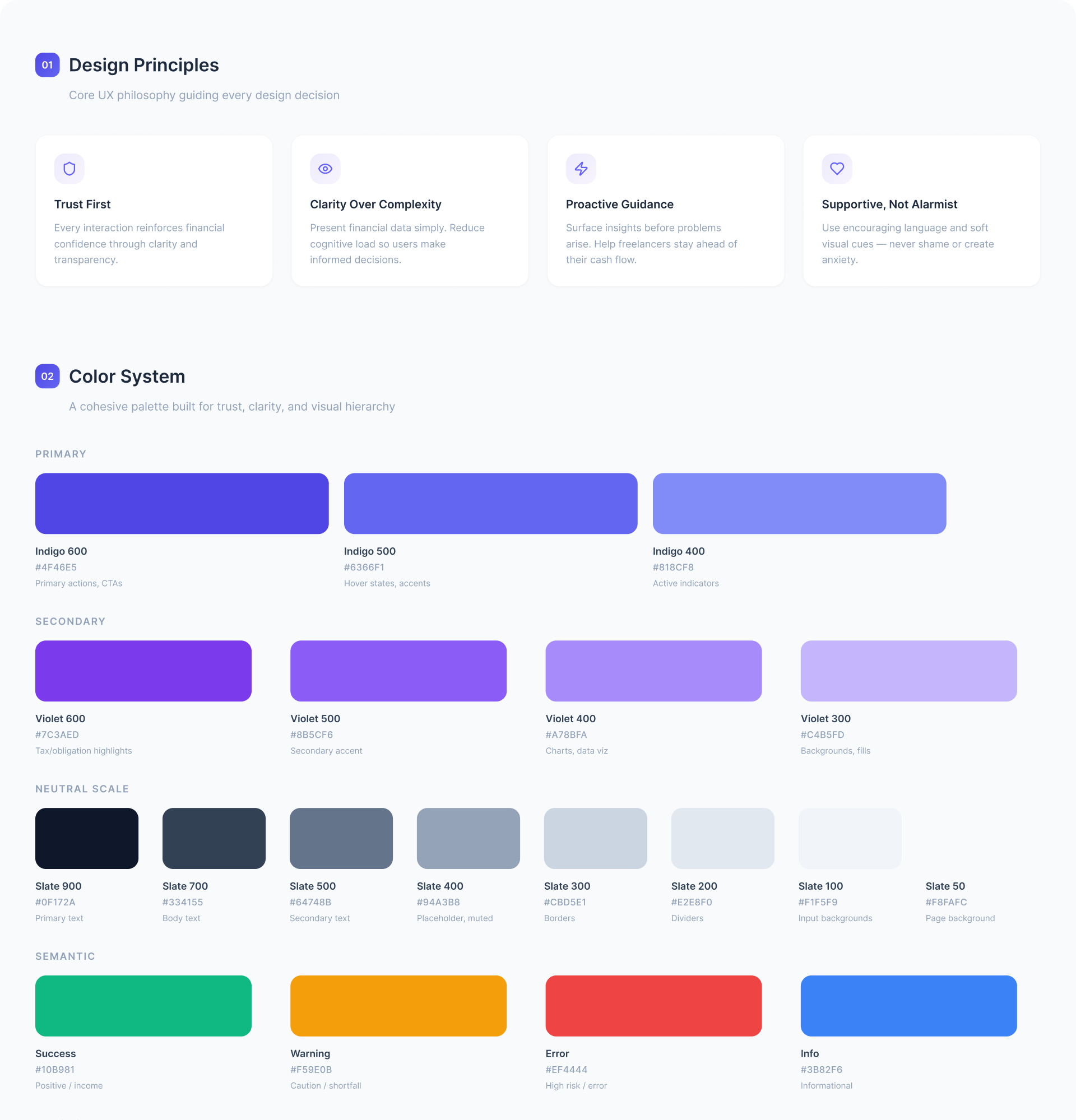
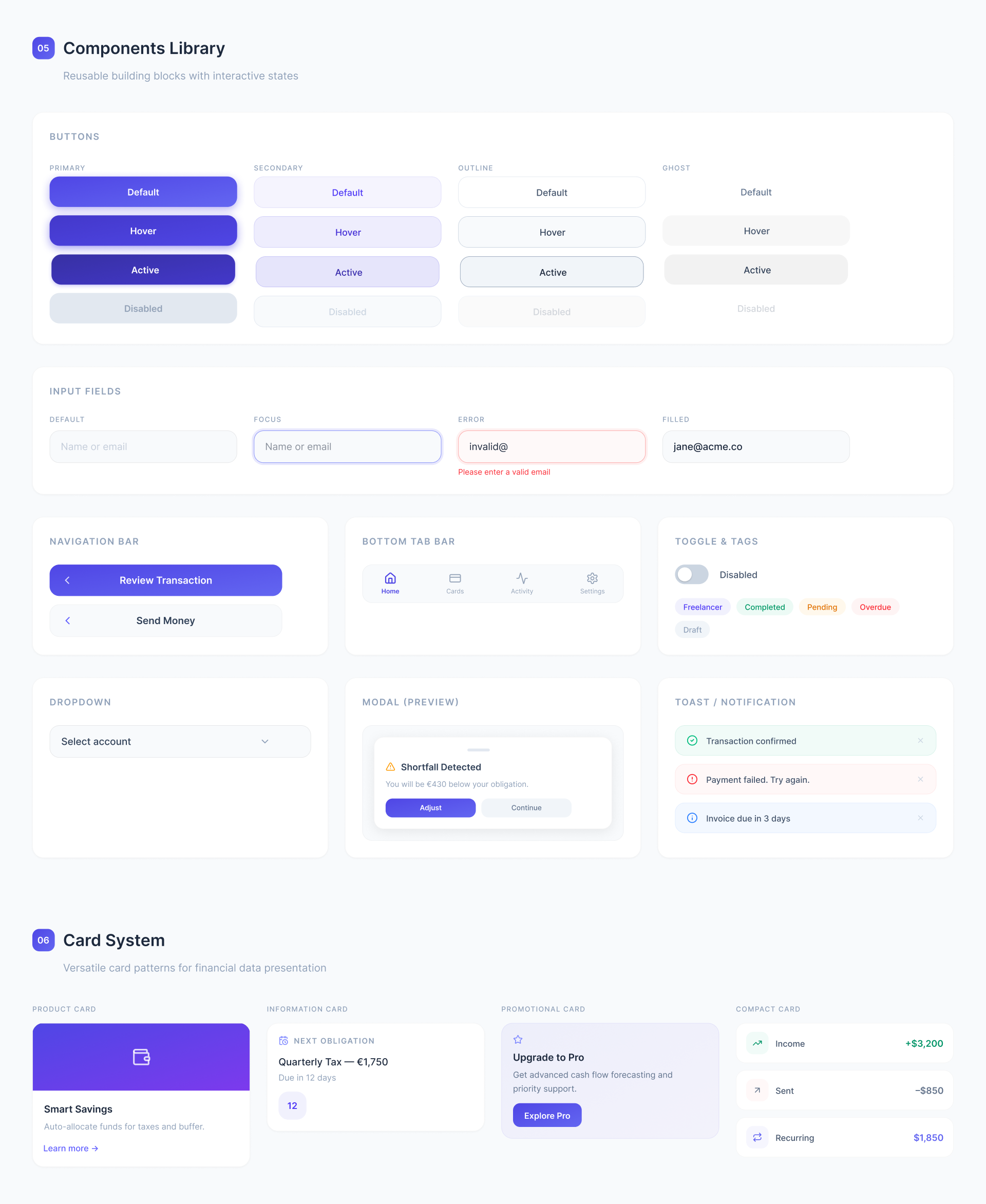
The principle that did the most work was supportive, not alarmist. A product that tells a freelancer they are about to be short of money is one bad tone away from being deleted. Every warning state uses encouraging language and soft visual cues; none of them shame.
What I took away
Financial products are not about displaying data — they are about shaping decisions. Safe-to-Spend only became credible once it was tied to time, obligations and consequences.
Transparency builds trust more reliably than simplification. Breaking down committed funds and exposing the tax logic increased perceived credibility more than any amount of visual tidying. Clarity in financial products is not about showing less; it is about showing the structure.
Projection reduces anxiety. When people saw future dips before they happened, the surprise went out of it. Foresight turned uncertainty into confidence.
What it proves
The usability study had five participants, which is why every finding above is written as a fraction rather than dressed up as a percentage. Small samples earn small claims, and these ones held.
What it demonstrates is the reasoning: system thinking, behavioural insight, and a design argument that survived contact with people who were not me.
The visual presentation of this project is also on Behance.
Results
4 / 5
Reviewed the projection before confirming
Five-participant usability study. Reported as fractions because five people is not a percentage.
3 / 5
Changed the transaction after seeing it
They saw a projected dip near the tax deadline and adjusted the amount.
5 / 5
Expected a visible confirmation
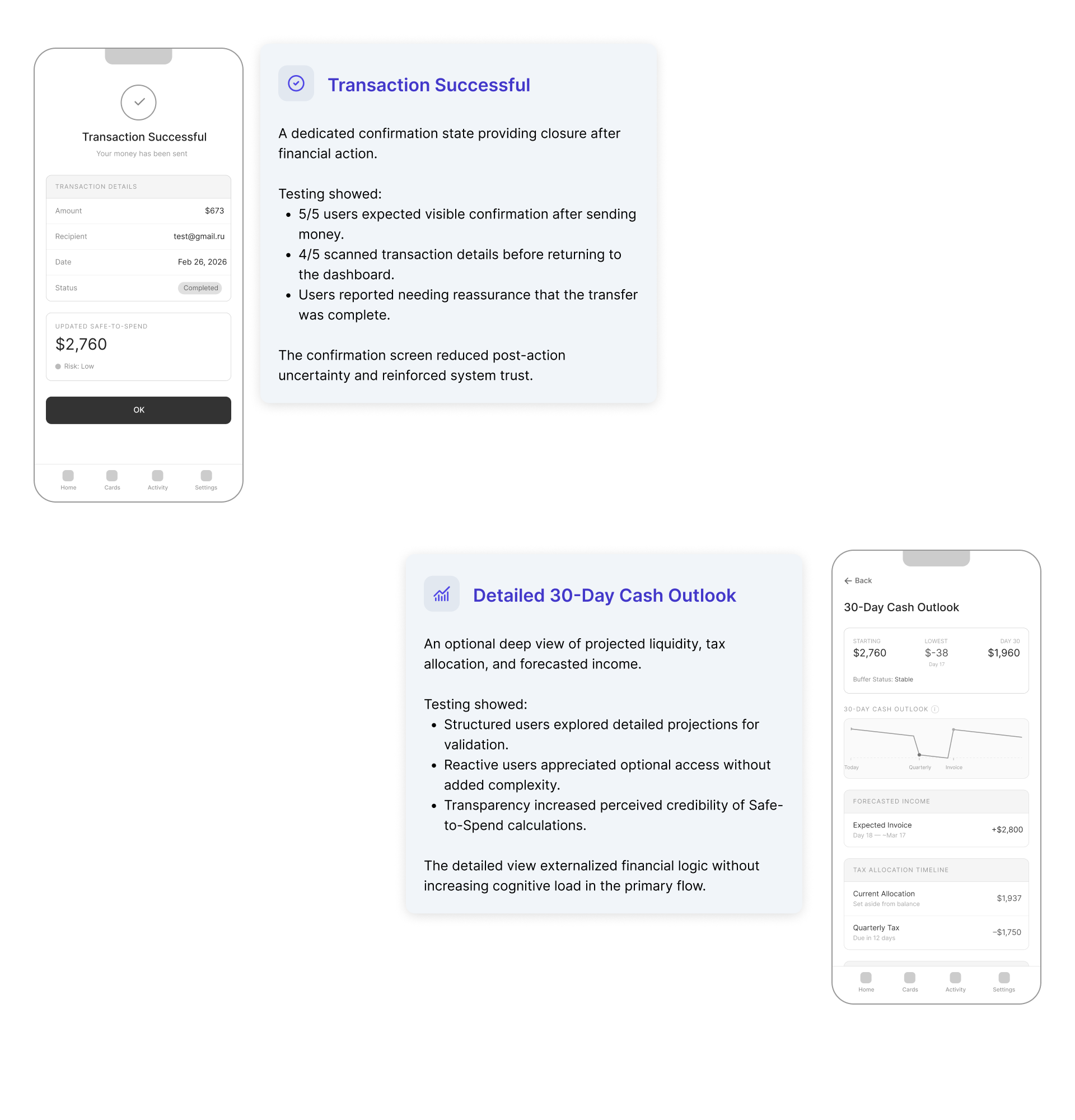
Every participant expected explicit closure after sending money. The concept did not have one until they said so.
4
Products audited
Deutsche Bank, N26, Revolut Business and Kontist — all of them lead with current balance.